AliExpress is the business-to-consumer
subsidiary of Alibaba.
It sells products directly to customers with no middle person and is an online e-commerce platform for buying products at lower prices than other similar services.
Research & Discovery
Customers lack trust in AliExpress. They report feeling that the site seems "sketchy" or untrustworthy. To compete in the market, AliExpress needs its website to display the reliability of its brand.
How might we design a site that makes users feel secure in completing an online transaction with them?
INTERVIEWS
My research focused on analyzing interview transcripts from three users discussing their online shopping habits and motivations. Key points included the retailers they frequented, types of items purchased, and factors influencing product quality.
Users expressed frustration with AliExpress's information overload and organization. Insights from the interviews highlighted the importance of a professional-looking website for trust, concerns about strange wording and low-quality images affecting perceived product quality, users' preference for leaving items in the cart rather than using the Wishlist feature, reliance on customer reviews for reliability assessment, and the impact of a generous return policy and prompt customer service on website loyalty.
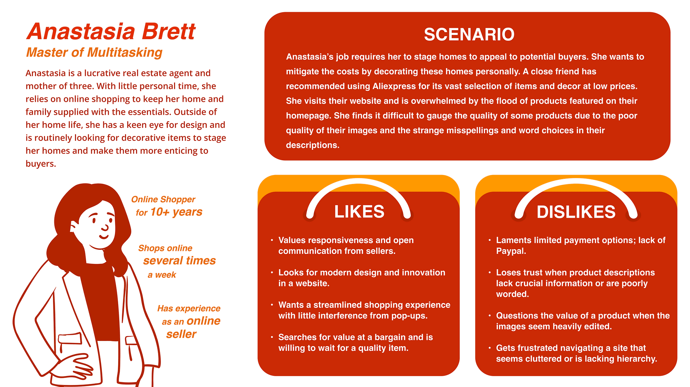
PERSONA
To effectively comprehend the specific user that would utilize the AliExpress site, I wanted to create a persona that reflected their particular experiences. Based on the interviews, I found a prominent type of shopper that I wanted to highlight; one who is visiting retailers like AliExpress looking for a deal but is very cognizant of possible risks and flaws in their site and products. This kind of user has specific methods like reading reviews to distinguish a good product from a bad one.
JOURNEY MAP
I utilized insights from the persona to create a user journey map, aiming to understand the steps involved in online shopping and address issues to boost user confidence. The map spanned from awareness to purchase completion, emphasizing touch-points like browsing the homepage, examining product pages, and navigating the checkout process.
The completed map revealed opportunities to reduce information overload on the homepage, alleviate confusion, and enhance ease of use by adding filters and additional payment methods at various stages in the shopping process.
UX FLOW
I used a UX Flow to understand AliExpress's structure and its impact on users during a purchase. The flow covered searching for items, adjusting specifications, and methods for verifying quality, concluding at the checkout and confirmation page. The challenge was to create a detailed yet streamlined core flow, considering multiple decision points without getting lost in branching possibilities. I found that AliExpress had a direction similar to competitors, providing a familiar and comfortable experience for most users.
SITE MAP
I suspected that certain elements of the website overwhelmed or diverted users from their intended purpose, based on interview complaints and user journey insights. I created a site map to visualize the layout and identify areas with too many options. The site map revealed main branching-off points from the homepage, such as social media, product categories, cart, help, and account.
I found that, according to the user's parameters, the homepage had too many options, causing confusion and distraction. The combination of an endless scroll of product images, a categories sidebar, and another sidebar for social media and coupons added unnecessary clutter with links that were not immediately useful.
A modern, decluttered, organized website with high-quality
images and a refined keyword search is an expectation many
consumers have that Aliexpress can potentially deliver.
I would make the following corrections to ensure the pain points I discovered get addressed:
• To ensure the user can accurately gauge the quality of a product, provide accurate and detailed descriptions with no misspellings, coupled with plenty of high-quality images and
videos of the product.
• Maximize the length of user retention on the homepage by reducing the number of product listings seen at a glance and eliminating pop-ups that intrude on the browsing experience.
• Add convenience and expedite the checkout process for the customer by providing a variety of payment options: such as digital wallet services like Paypal.
Customers enjoy the competitive prices and variety of products available to peruse. With improvements to the ease of use on the site, we can increase the frequency of their visits and gain their trust as a reliable source for a unique bargain.