Cash App is a mobile payment solution for
sending and receiving money from peers.
It is mainly utilized by young adults and is consistently one of the most popular options for transactions between peers in app stores. Users often remark that its ease of use and minimal design lend themselves favorably to customer retention over similar apps.
Key Features
One area where the app has been found lacking is the limited ability to split costs between large groups. Customers using Cash App typically find workarounds to share a bill when they participate in social events like dining or recurring payments like rent. This leaves users frustrated and confused when it comes time to pay the bill.
So we asked ourselves...how might we create a feature that simplifies and streamlines the action of splitting bills between friends and family on Cash App?

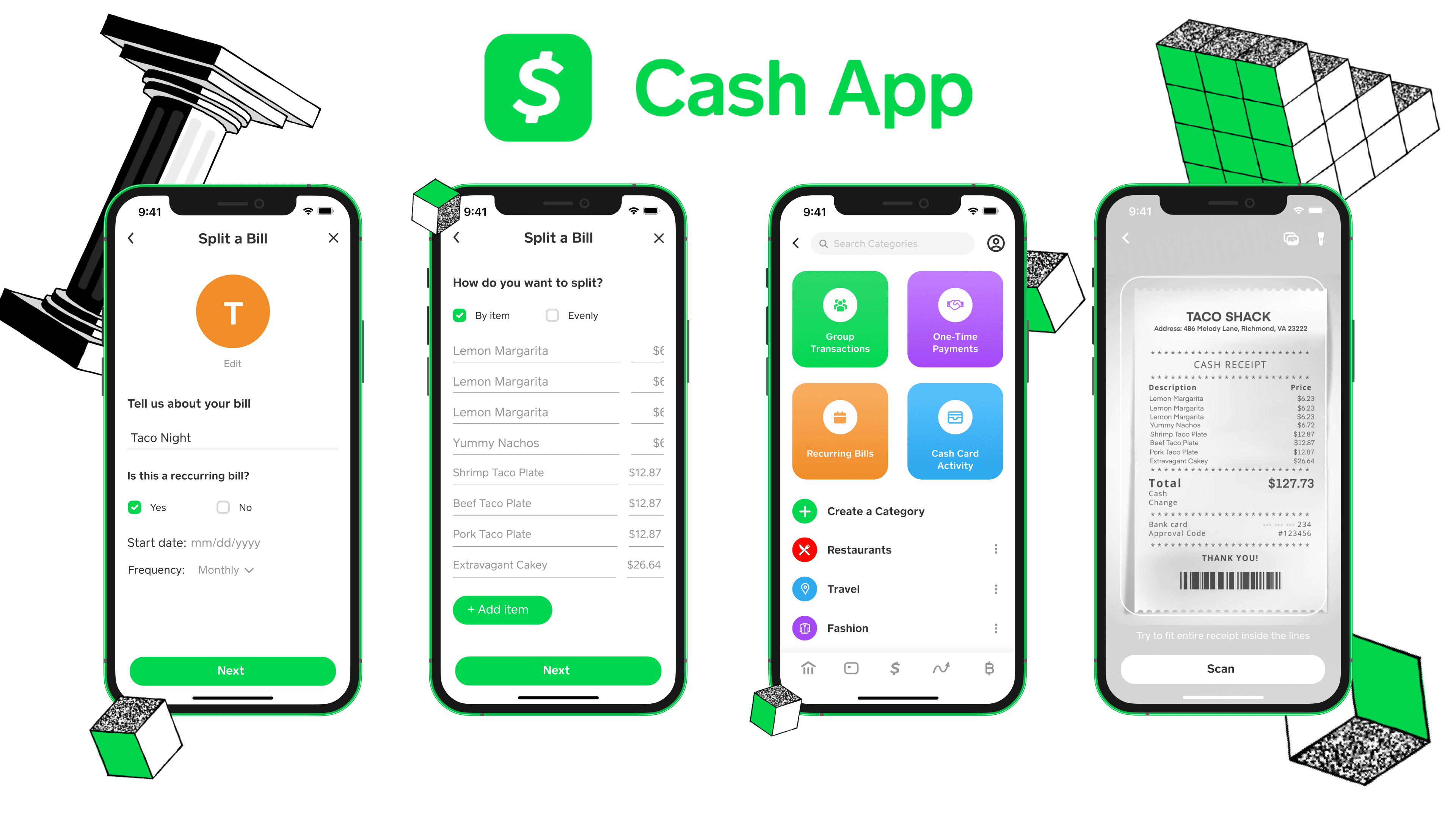
Users can upload a photo of their receipt and have their information automatically transferred or manually input it with the option to edit at any point.

Users can select whether to split a bill evenly amongst the group members they add to the event or split according to the item belonging to each person.

Present the option to classify a payment as recurring for bills such as rent and groceries and a one-time option for outings such as dining and other singular events.

Group Payments are automatically categorized; users can create custom categories, and incomplete payments display a progress bar until fully paid.
Research & Discovery
We wanted to understand how users split a bill within a group through mobile payment apps like Cash App. We conducted several research methods to familiarize ourselves with user habits and preferences.
DESK RESEARCH
The project begins with an initial meeting to understand your goals and requirements. From there, we move through direction setting, information architecture, design, feedback and revisions, and final delivery. Each stage is reviewed and approved before moving on to the next.
SWOT ANALYSIS
USER SURVEY
Two rounds of revisions are included at each major design stage. Minor changes, such as text or color adjustments, are covered. Significant changes to an approved structure or requests for additional pages may require extra time and cost.
AFFINITY MAP
A limited support period is included after completion for bug fixes and basic guidance. Additional content updates, new pages, or feature improvements can be handled through an ongoing maintenance plan or separate requests.
JOURNEY MAP
A limited support period is included after completion for bug fixes and basic guidance. Additional content updates, new pages, or feature improvements can be handled through an ongoing maintenance plan or separate requests.
PERSONAS
A limited support period is included after completion for bug fixes and basic guidance. Additional content updates, new pages, or feature improvements can be handled through an ongoing maintenance plan or separate requests.
Low to High Fidelity
From preliminary sketches to the final screens, we concentrated on maintaining an easy-to-follow flow that would not leave users confused or frustrated. We wanted our bill-splitting feature to resemble a natural inclusion that wasn't out of place amongst Cash App's other features.
SET UP RECURRING / ONE-TIME PAYMENTS
SPLIT EVENLY/BY ITEM
TRACK GROUP PAYMENTS
Initially, in brainstorming sessions, the bill-splitting process involved a group card that users could collectively deposit money into and use in group outings. However, we quickly realized that it added an extra barrier for users that lacked convenience.
We instead turned to a more straightforward process where the user could begin the bill-splitting process by simply pressing a dedicated icon on the home screen.


Style Guide
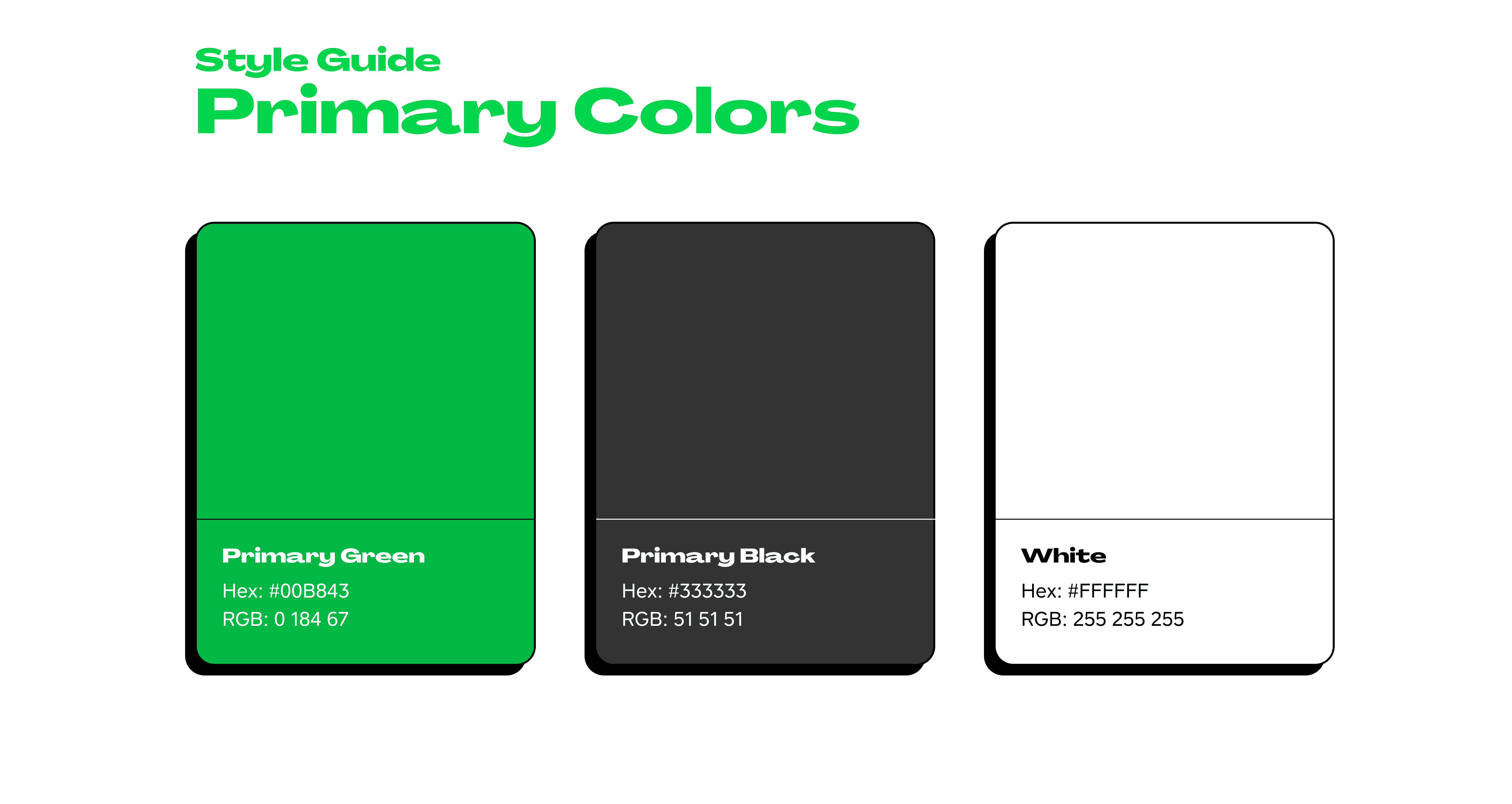
Because we were working with an existing product, we stuck closely to the brand's parameters. The team studied the app at length so we could properly utilize the elements in a way that was familiar to users and would not disrupt the flow of the app.
Buttons, menus, and similar components were some of the novel elements we had to create for our bill-splitting flow; we went through many iterations until we made a final version that matched closely with the app's current visuals.